- Discipline
- Brand identity
- Course
- Graphic Design for New Media, BCIT
- Team
- Solo
- Pieces
- Logo system, colour system, typography, applications
The idea
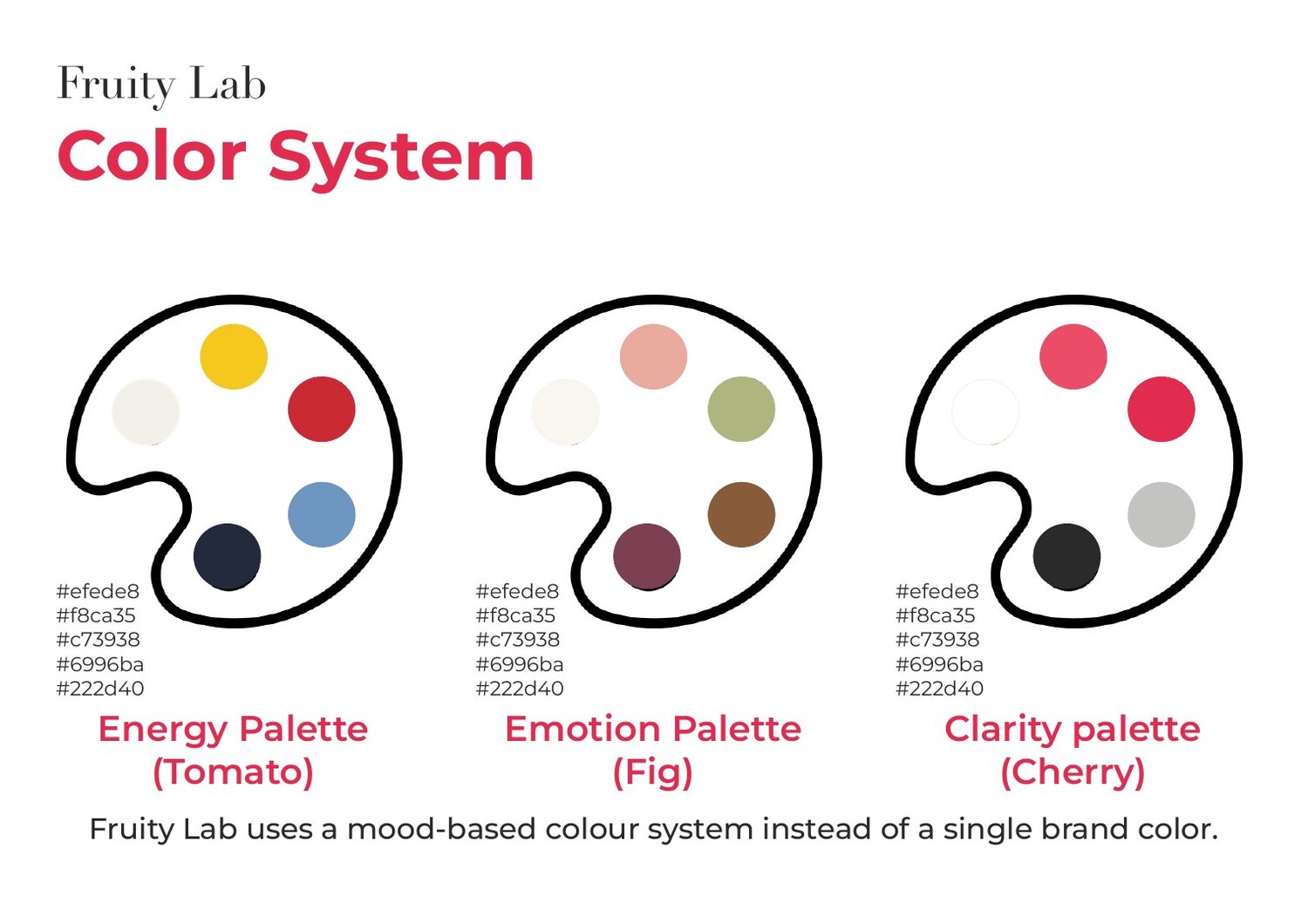
Fruity Lab is a creative brand that shows contrasting moods through minimal, fruit inspired design. It runs on three moods, and each one has a fruit: Tomato for energy, Fig for emotion, Cherry for clarity.
Three moods
- TomatoBold, contrast, experimental.
- FigWarm, organic, soft.
- CherryMinimal, modern, balanced.
Colour
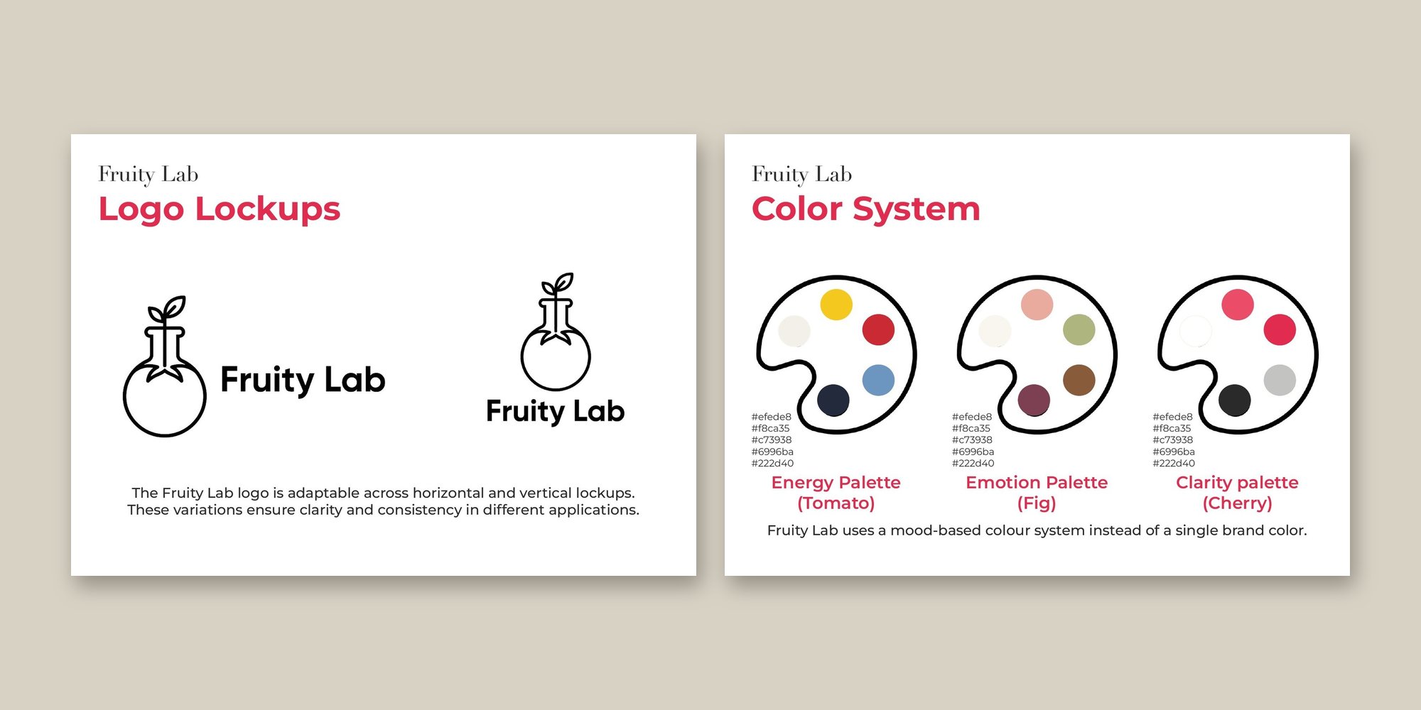
Instead of one brand colour, Fruity Lab has a palette for each mood. I sampled the colours from a moodboard for each mood, then refined them with contrast and accessibility checks.
The logo
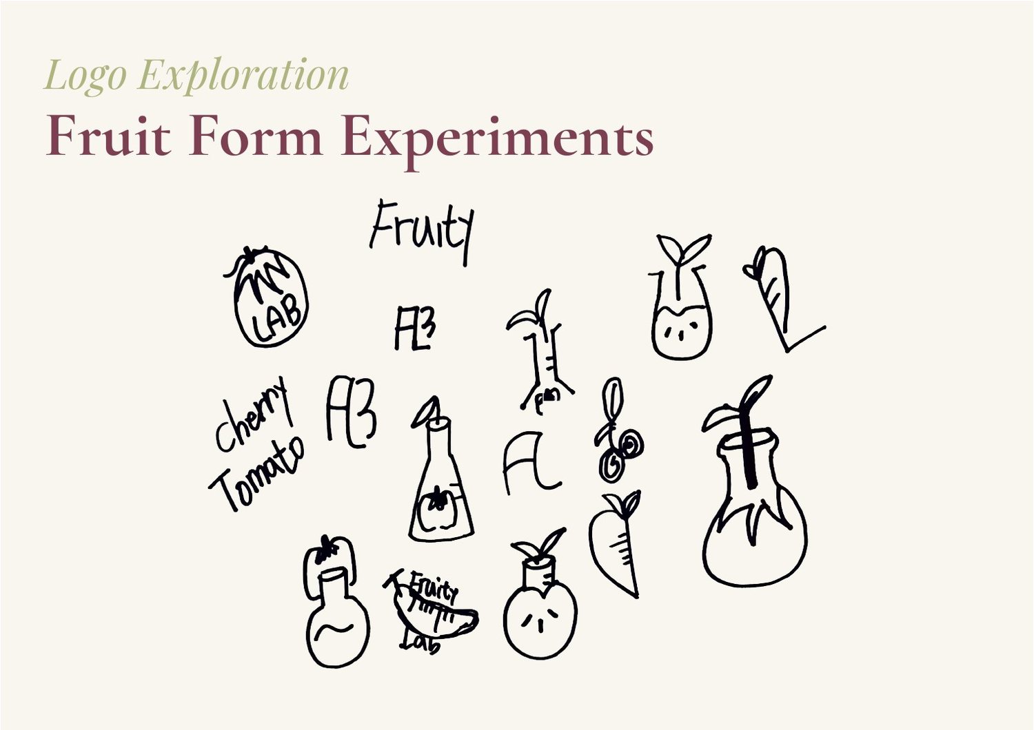
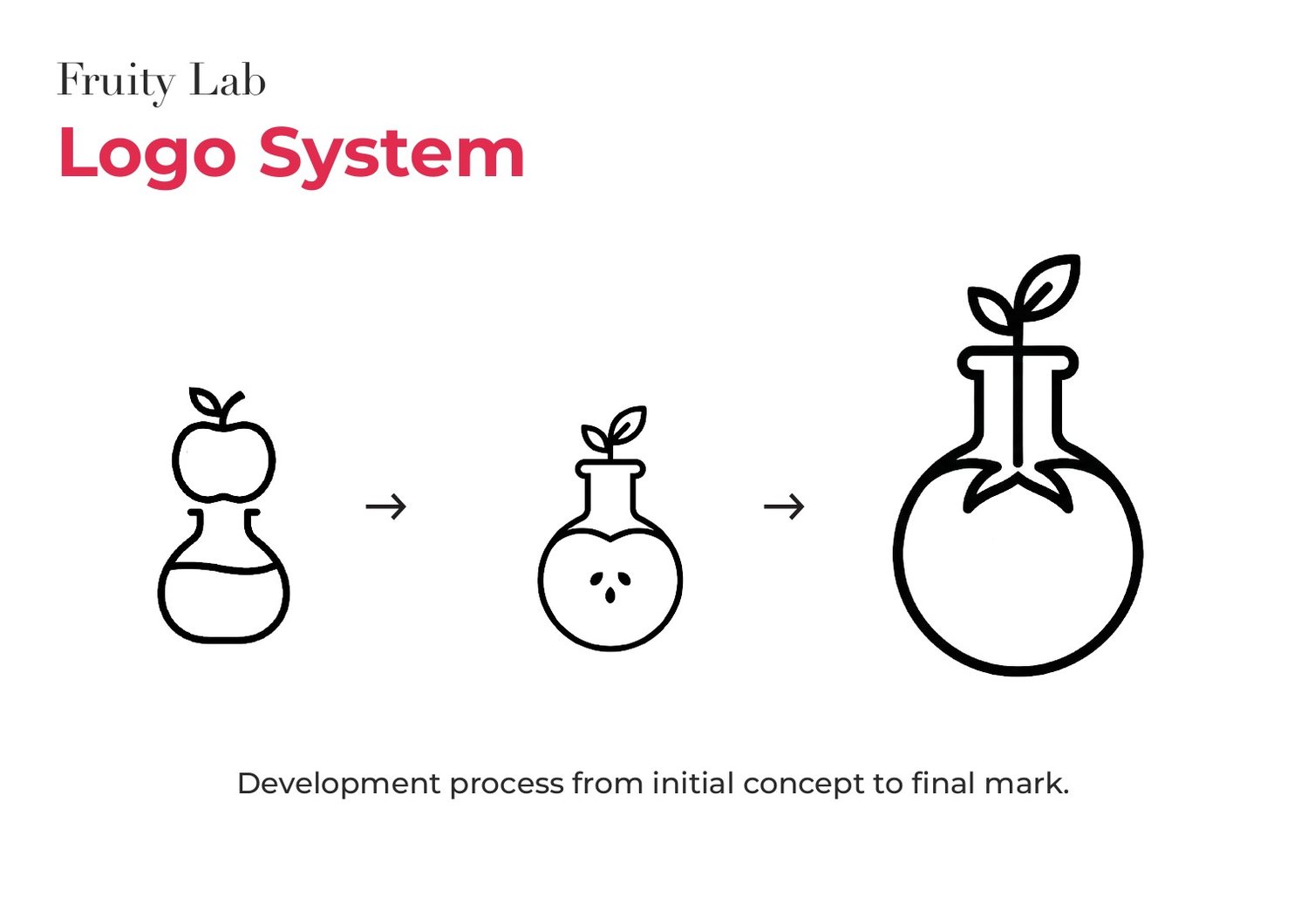
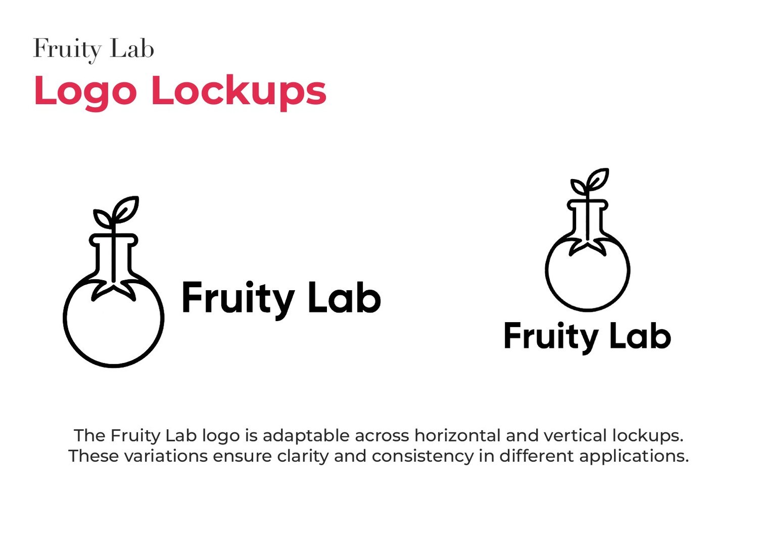
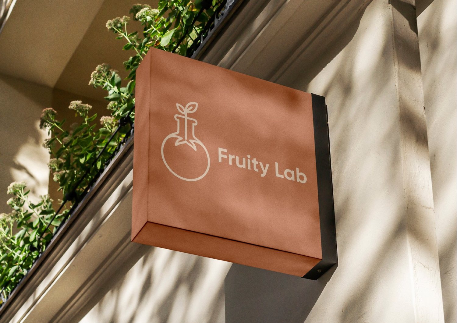
I sketched fruit forms by hand and looked for a shape that could hold both halves of the name. The final mark is a fruit that is also a laboratory flask, with a leaf on top. It works in horizontal and vertical lockups.
Type and applications
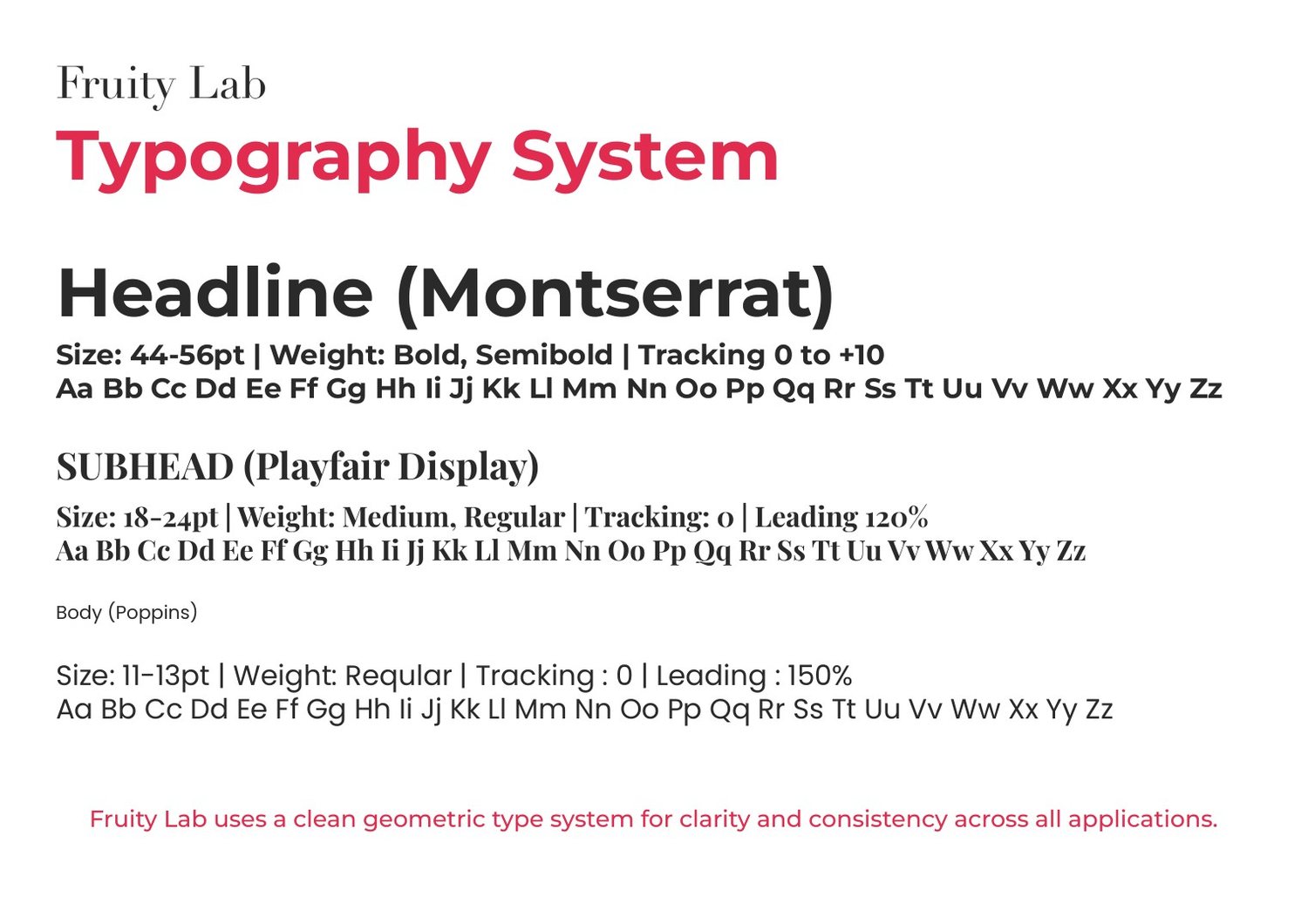
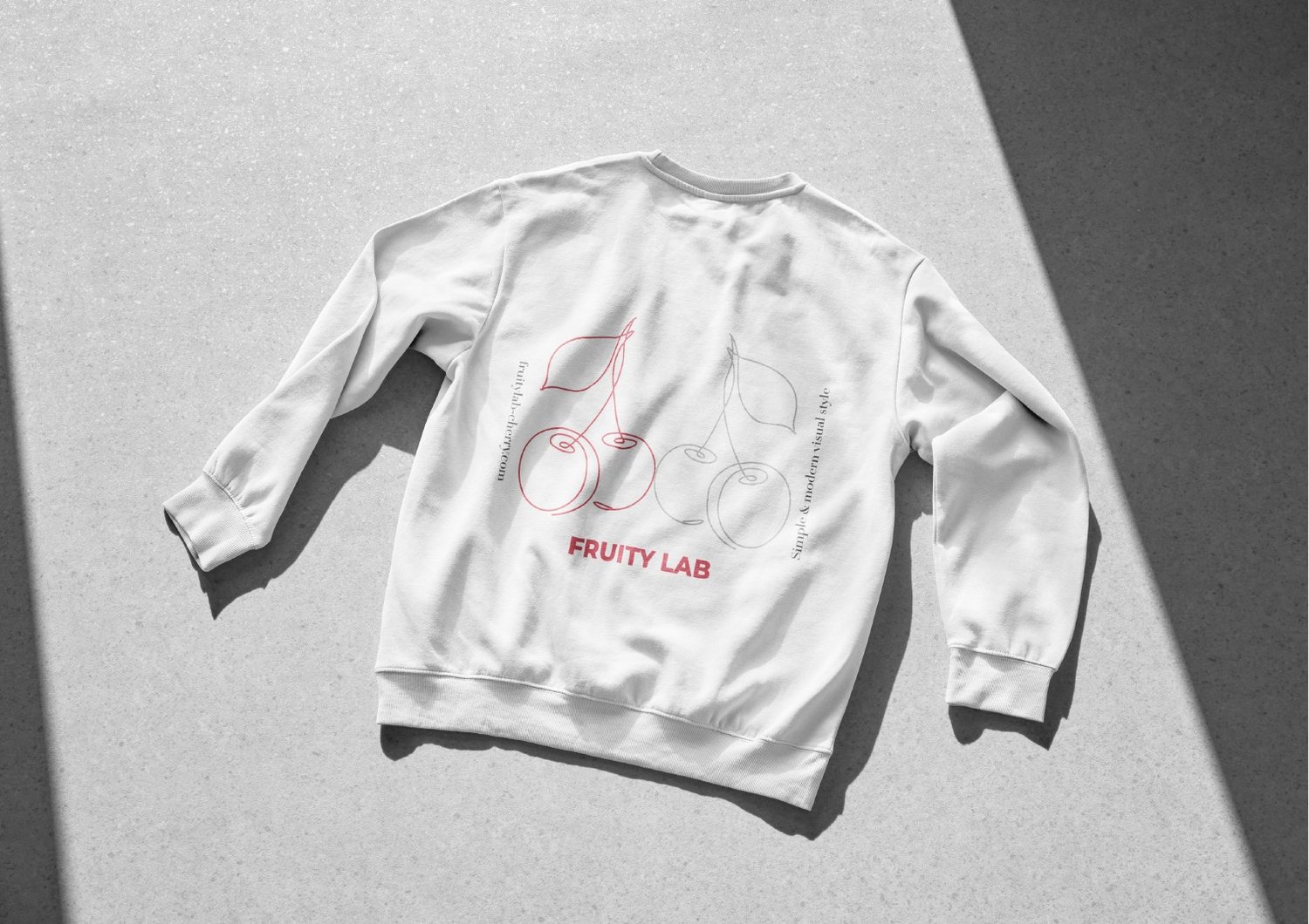
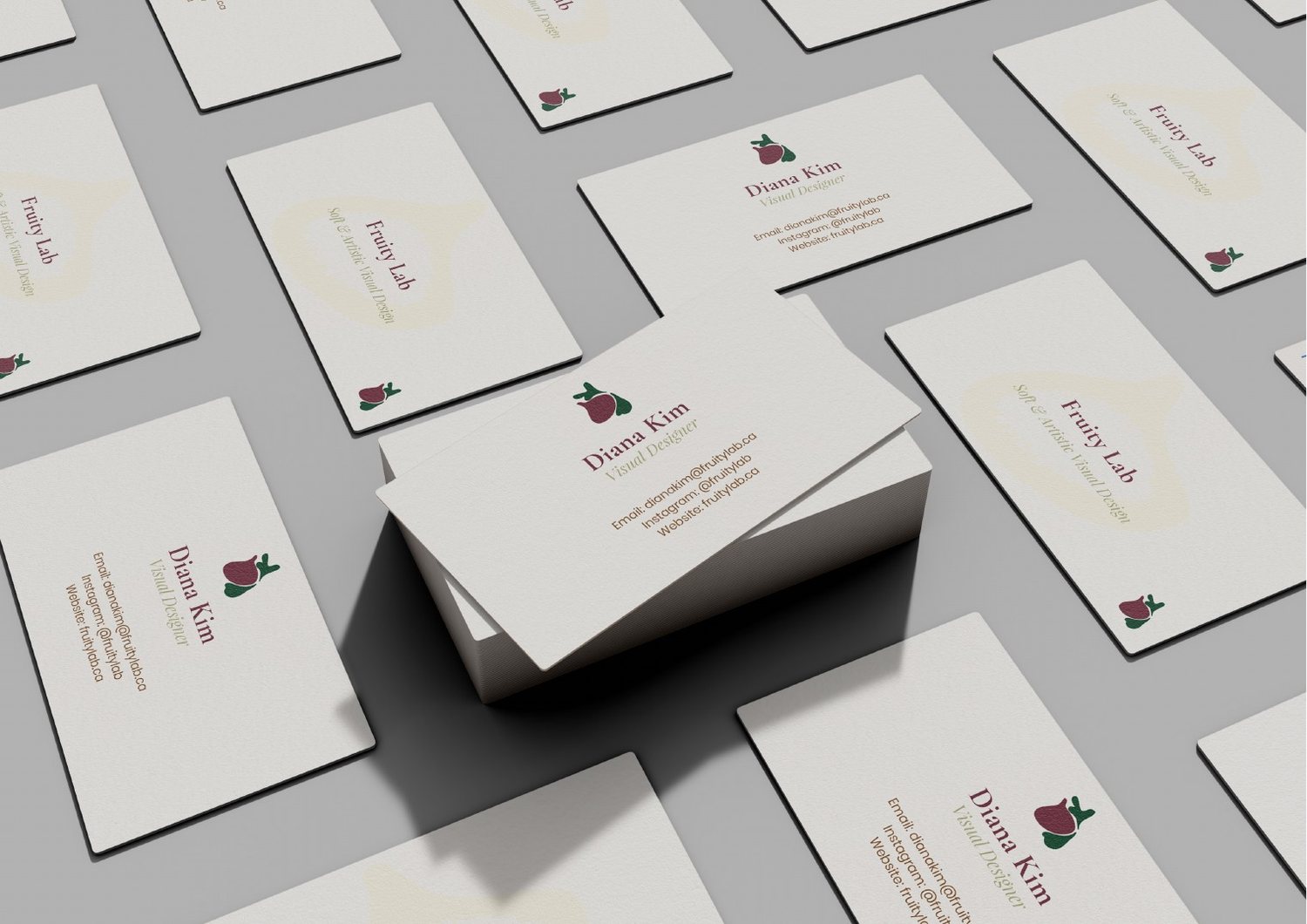
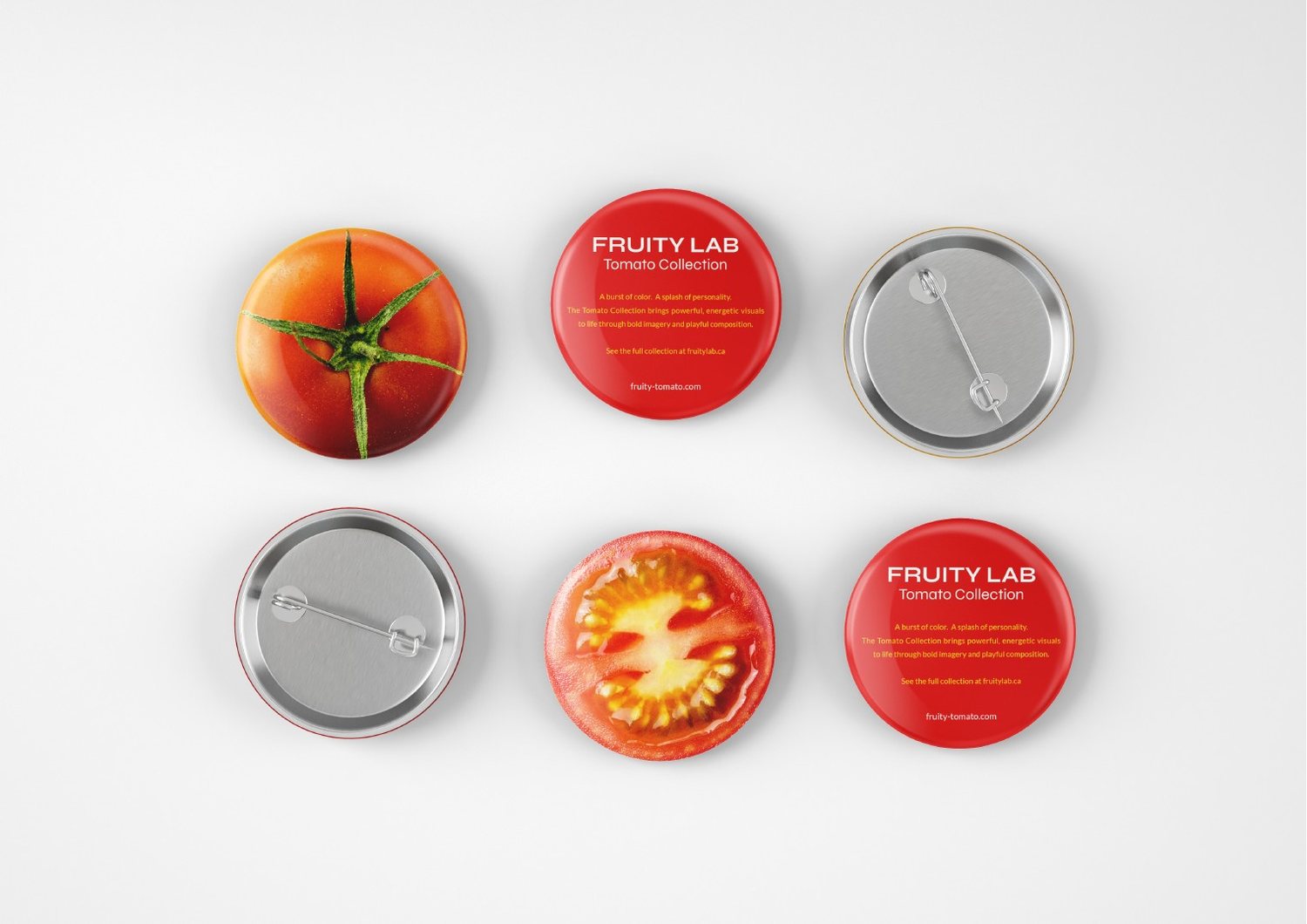
Montserrat sets the headlines, Playfair Display the subheads and Poppins the body text. I applied the identity to a shop sign, a sweatshirt, business cards and pins.