- Discipline
- UI/UX design, brand
- Course
- UI/UX Strategy 2, BCIT
- Team
- Diana Kim, Gigi, Daisy
- My role
- Designer: all design deliverables
- Tools
- Figma, Illustrator
The problem
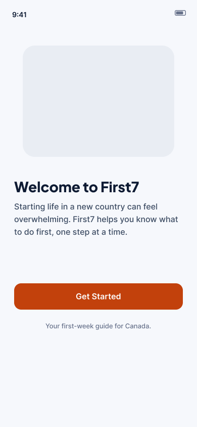
International students and newcomers arrive tired, jet lagged and often reading in a second language. Everything is urgent at once: a SIM card, transit, a bank account, groceries, a health card, emergency contacts.
Not knowing the order is the real stress.
My role
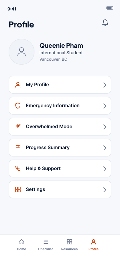
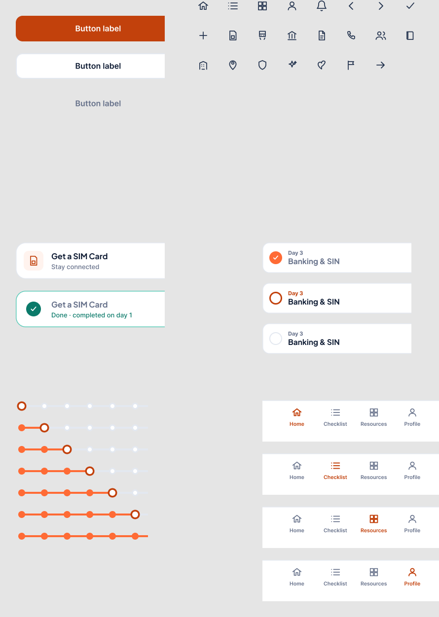
I was the designer on a team of three with Gigi and Daisy. We did the research together, and I ran a survey with people in my own network. I made all of the design deliverables: the wireframes, the Figma prototype, the design system and components, the logo and brand style guide, and the presentation slides.
The idea
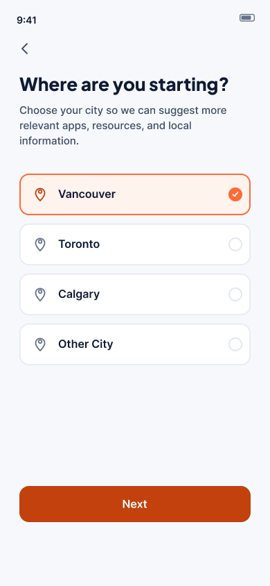
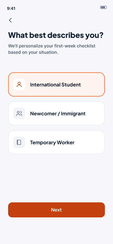
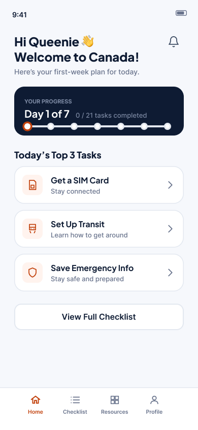
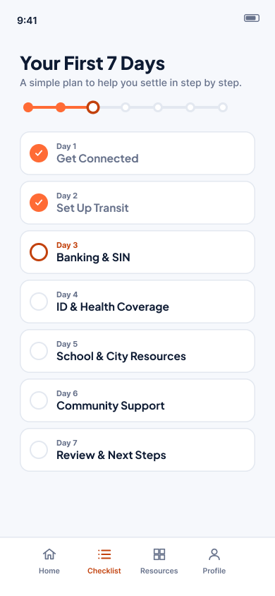
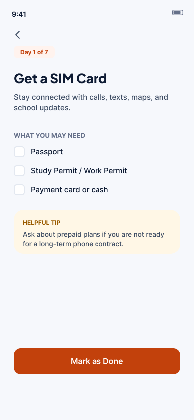
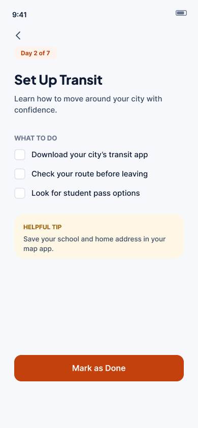
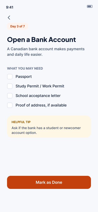
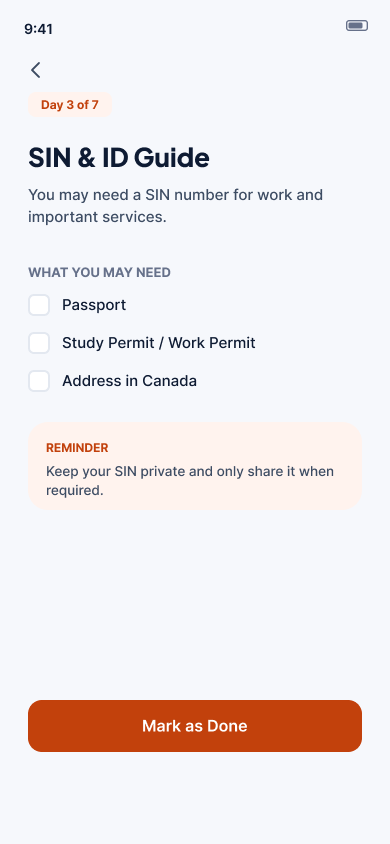
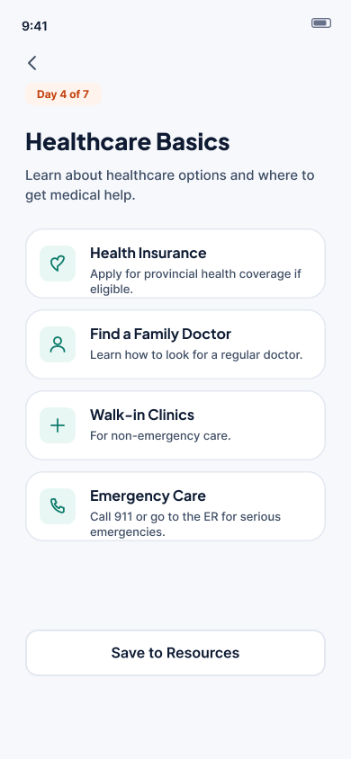
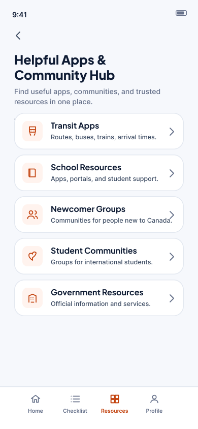
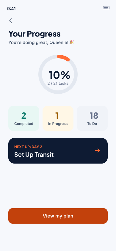
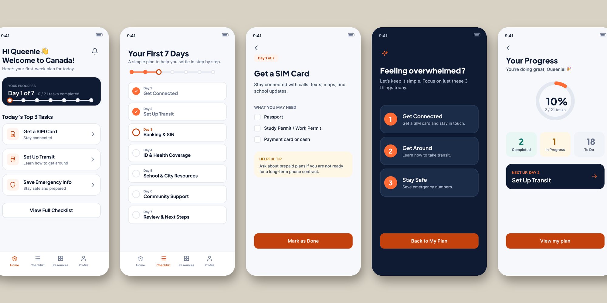
First7 turns an overwhelming pile into a sequence: one day, a few tasks, visible progress. After choosing a city and a profile (international student, newcomer or temporary worker), the user gets a seven day plan. Day 1 is getting connected, then transit, banking and SIN, ID and health coverage, school and city resources, community support, and a review of next steps.
Design decisions
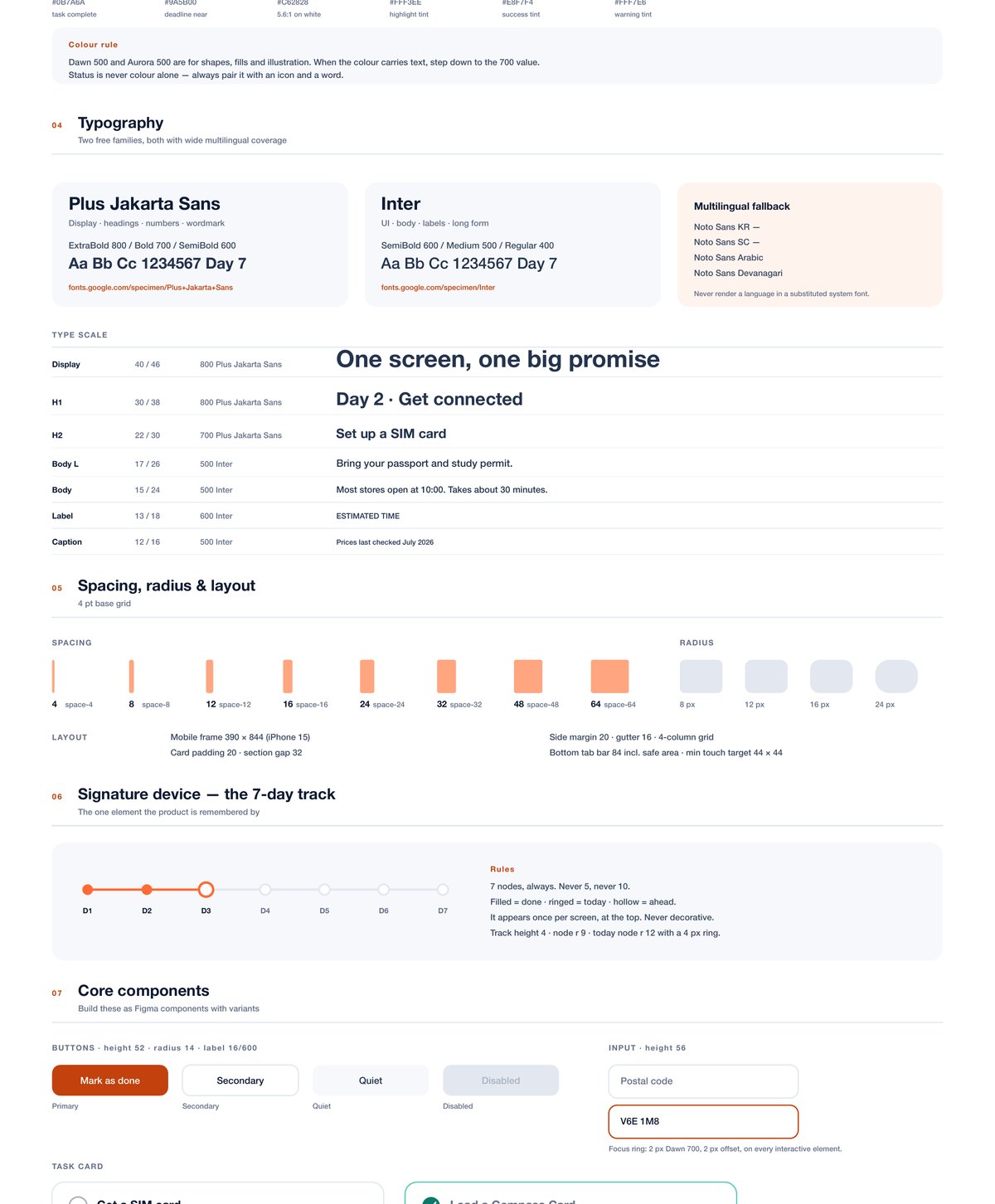
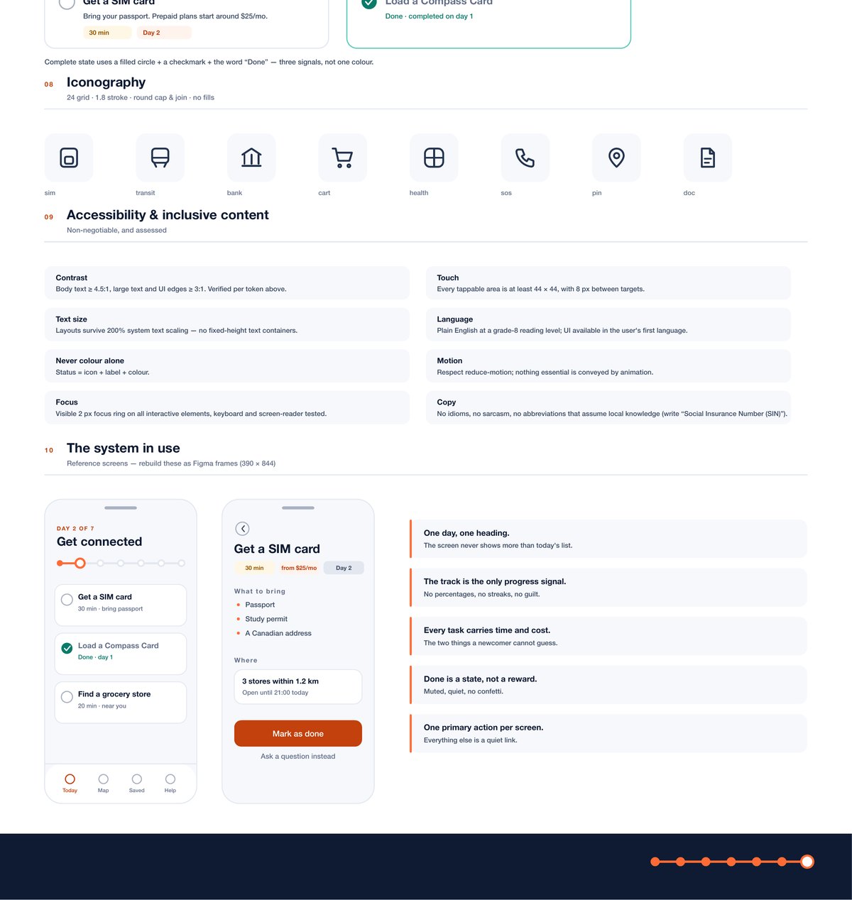
- The 7 day trackThe one element the product is remembered by. Seven nodes, always: filled is done, ringed is today, hollow is ahead. It sits once at the top of the screen.
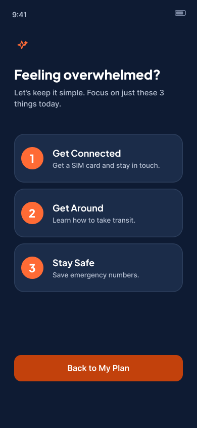
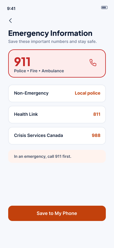
- Overwhelmed ModeWhen it is all too much, the plan shrinks to three things for today: get connected, get around, stay safe.
- Plain words"Open a bank account", not "Financial onboarding". Every screen answers two questions: what do I do today, and how long will it take?
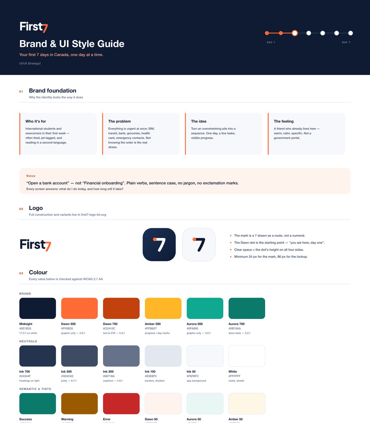
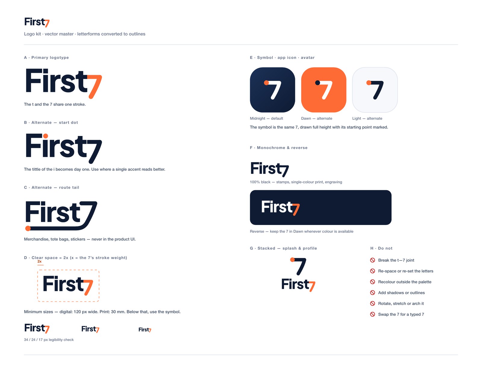
- A friend, not a portalThe brand should feel like a friend who already lives here: warm, calm and specific. The logo is a 7 drawn as a route, with a dot marking day one.
Accessibility
I wrote accessibility rules into the style guide. Every colour is checked against WCAG 2.1 AA, status is never shown by colour alone, touch targets are at least 44 by 44, layouts survive 200 percent text size, motion respects reduced motion settings, and copy is plain English with no abbreviations that assume local knowledge.